OMPay
OMPAY’s rebranding and repositioning marked a new chapter for Oman’s payment gateway nationwide, transforming it from a functional tool into a scalable financial ecosystem built for long-term trust and maturity.
-
Following Omantel’s acquisition of OMPAY, the brand needed to evolve from an early-stage, transactional product into a credible financial platform built for expansion.
Challenge
The challenge was to establish independence while maintaining a subtle relationship with the parent brand, allowing OMPAY to grow beyond simple buyer–seller transactions without losing institutional trust.Solution
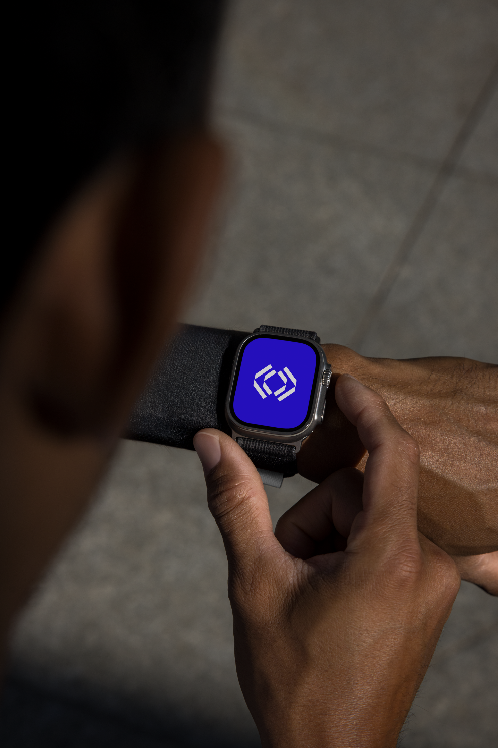
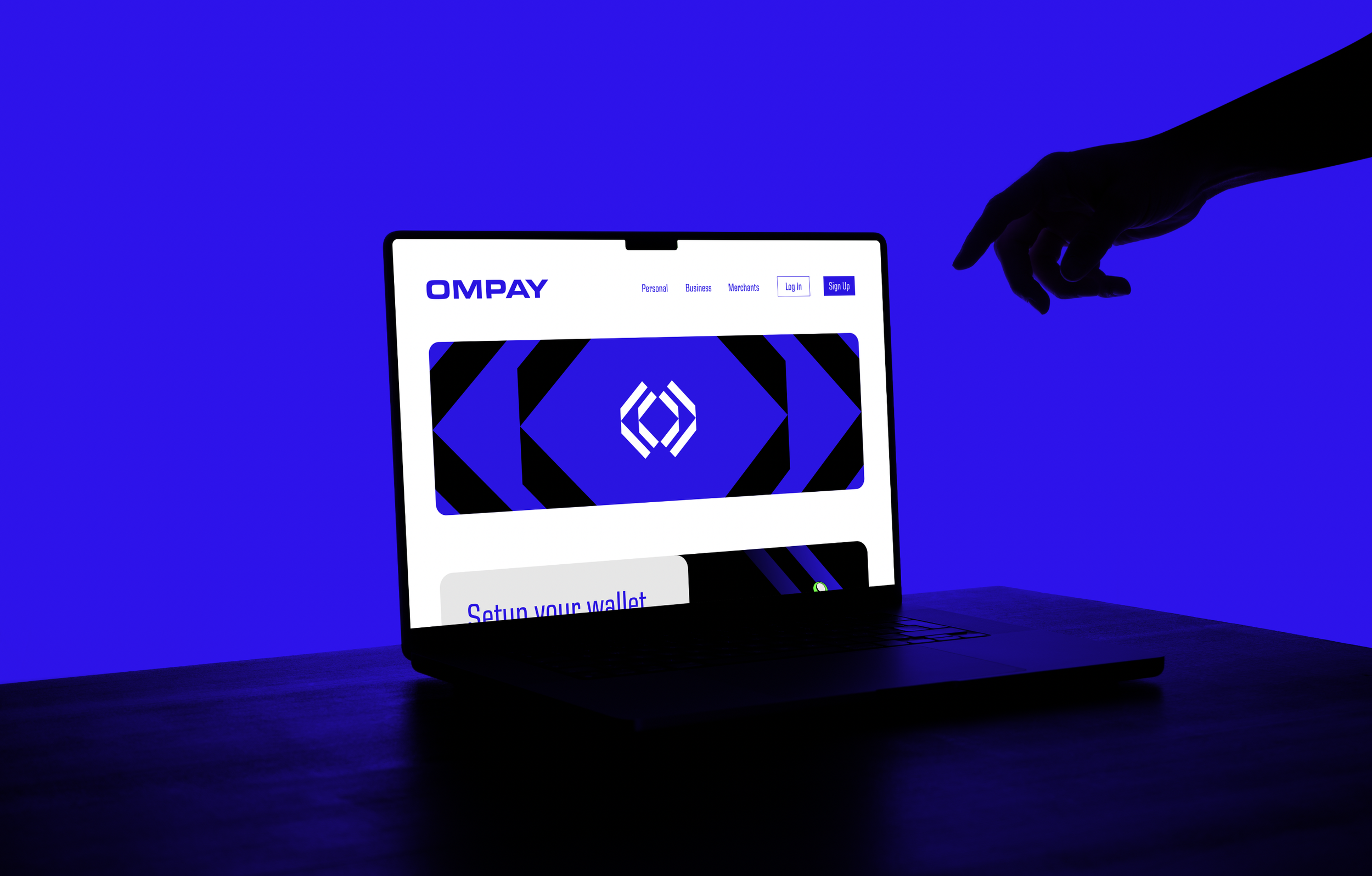
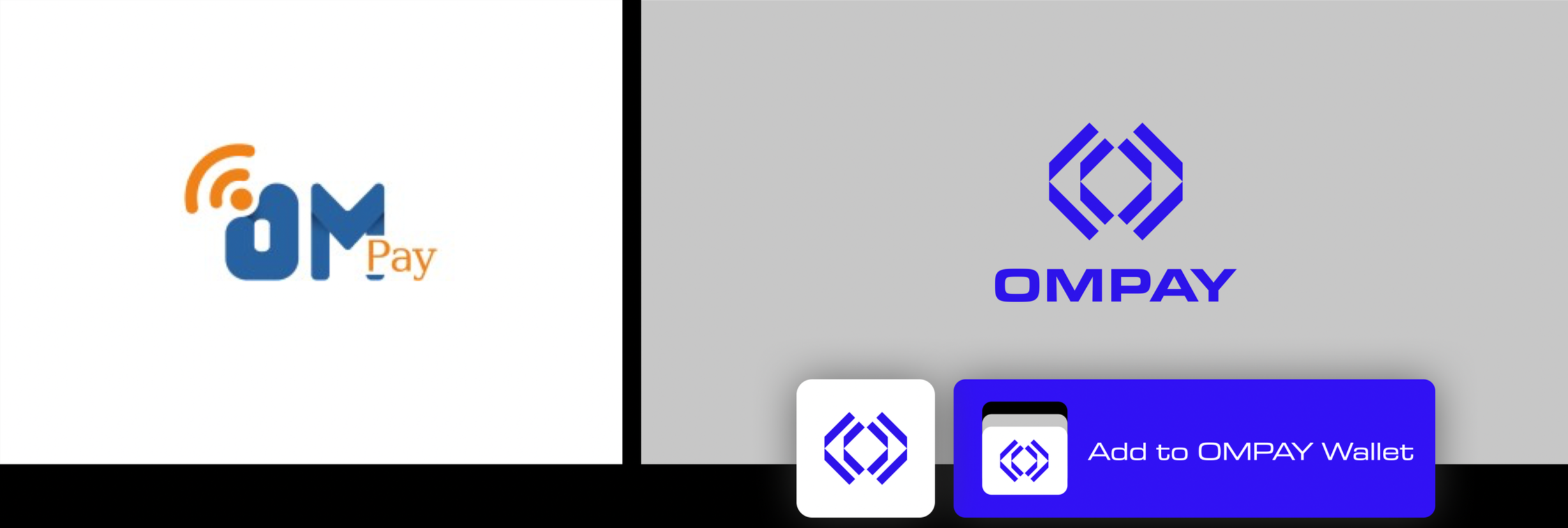
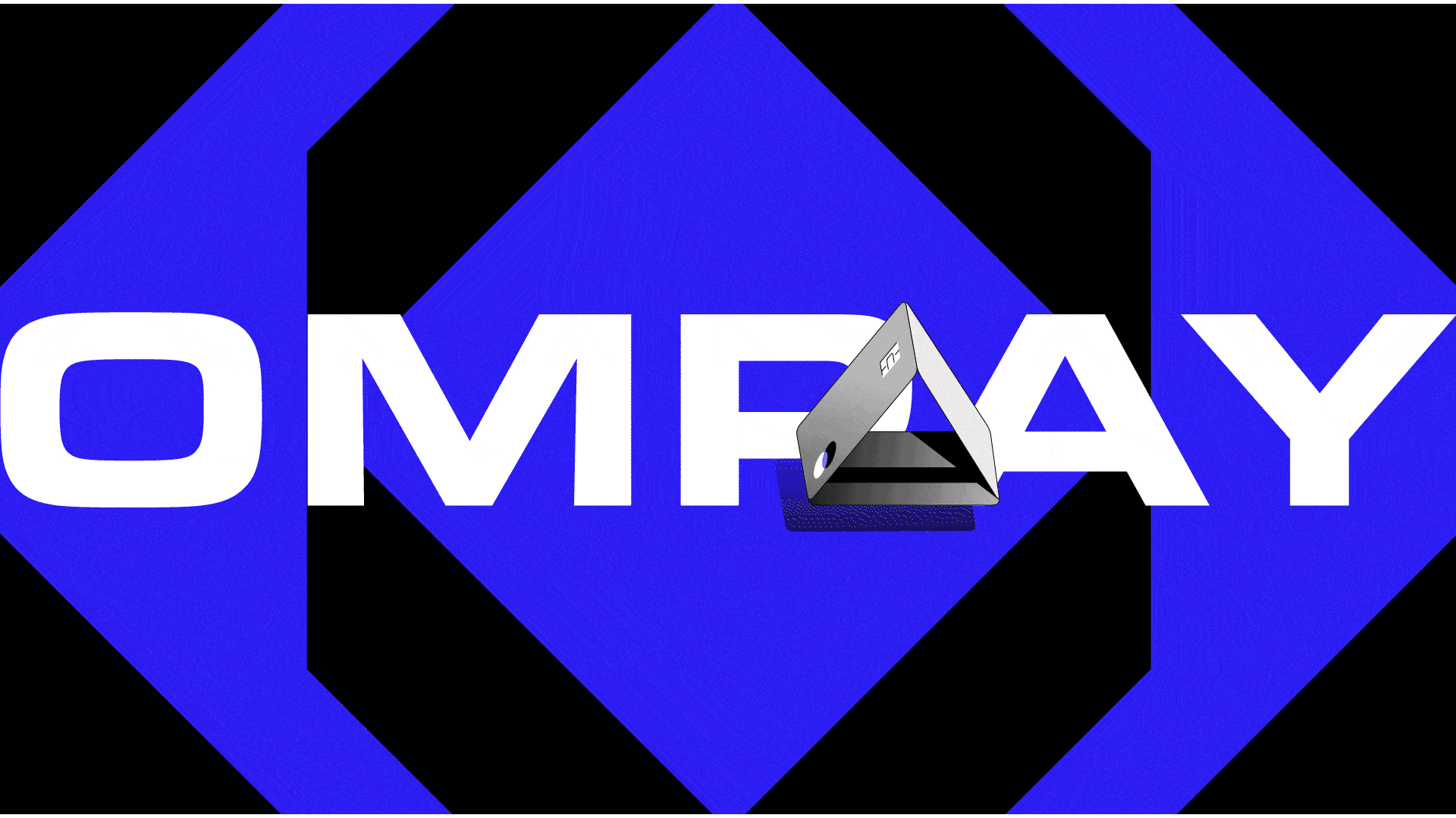
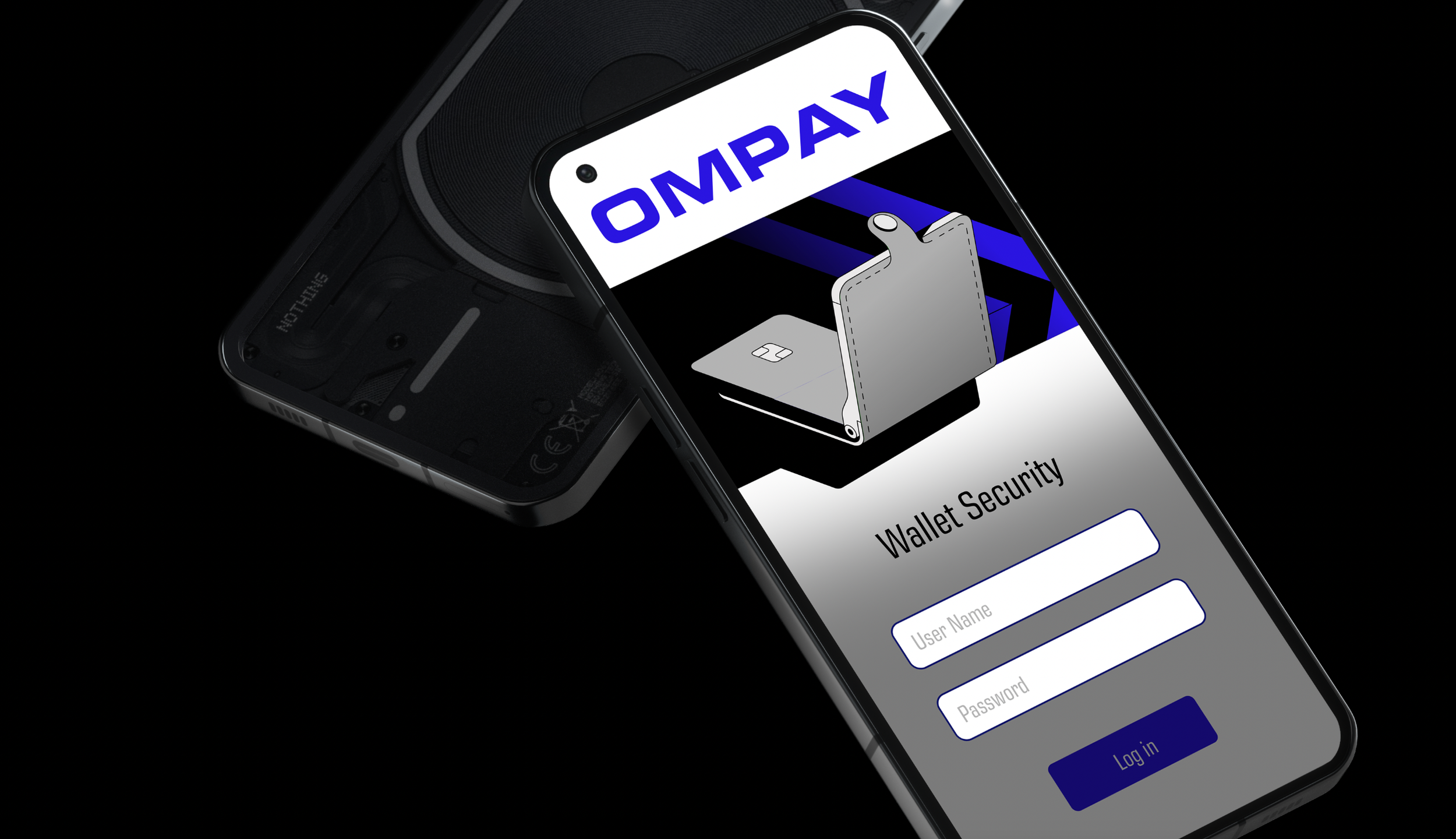
We developed a new identity centered around clarity, confidence, and reach. The logo embeds the letters O and M within a symbol that subtly references Omantel’s diamond geometry, creating a visual link without direct inheritance. A logo that expresses duality: expansion and transaction through outward-facing arrows.Trust meant our wordmark had to claim space: a modern, bold wide typography that signals reassurance and maturity while positioning OMPAY as a long-term financial ecosystem rather than a single-use payment app.
Client
Omantel
Advertising Agency
Leo Burnett
Branding Studio
Gom Desig

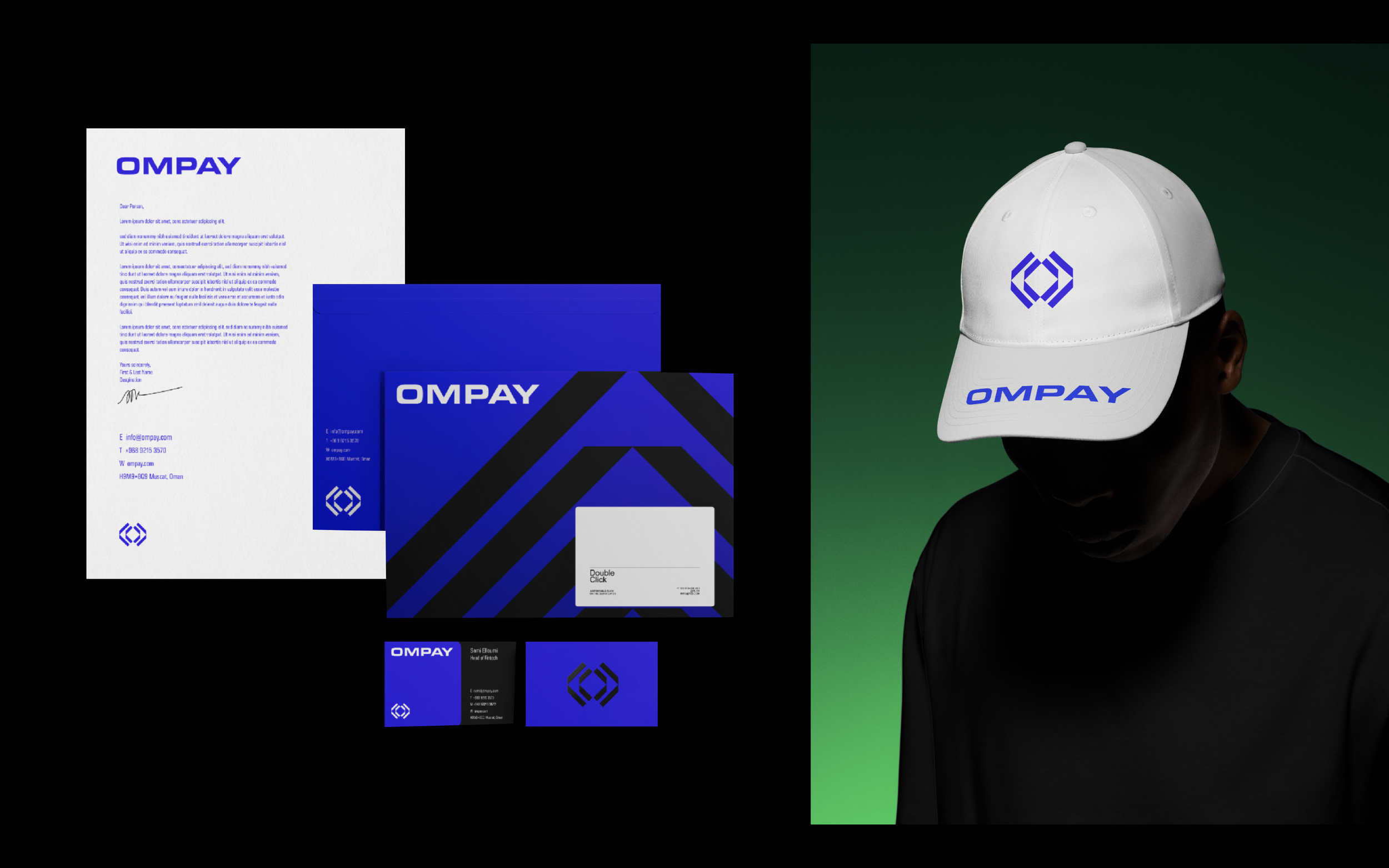
A visual system built to support long-term growth beyond peer-to-peer payments.