LANDMARK 50 years
Brandmark lock-up and visual system for Landmark Group’s 50-year anniversary.
-
To mark its 50th anniversary, Landmark needed a brandmark that could celebrate the milestone while signaling an uplift to the brand’s value.
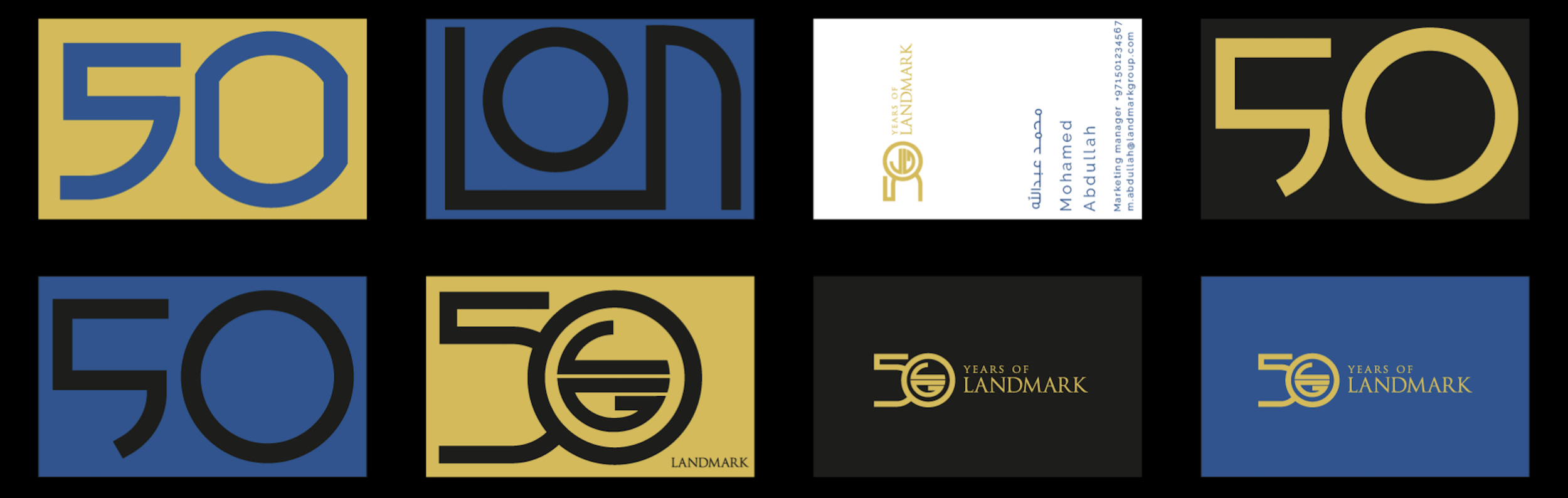
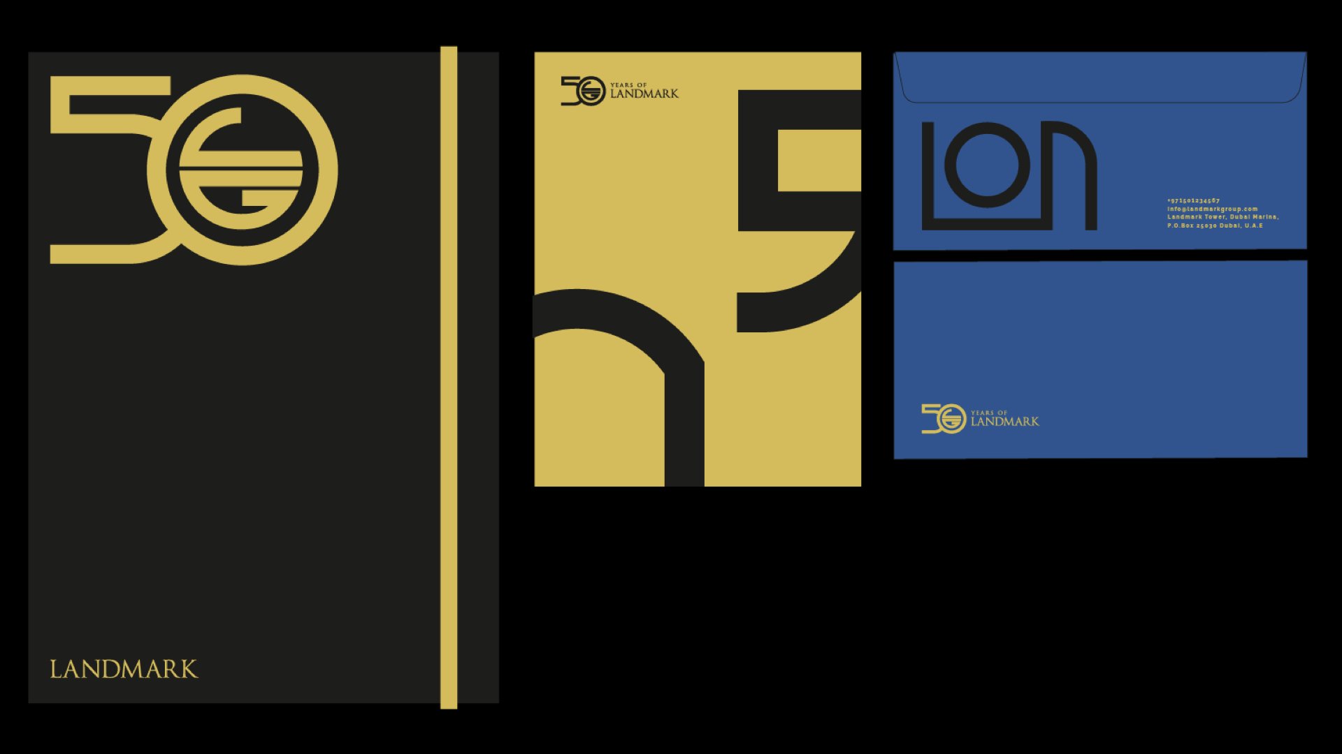
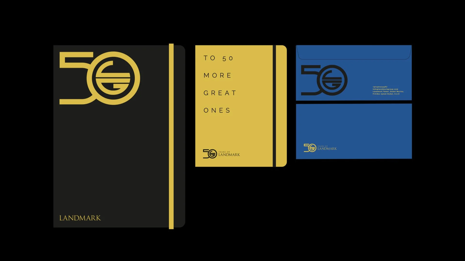
Using the Landmark Group emblem as the foundation, we developed a modular grid system that allowed the anniversary mark to evolve across applications while remaining unmistakably part of the brand.Rather than treating the “50” as a static symbol, the system explored multiple interpretations within the same framework, varied in form, consistent in spirit. The approach created a dynamic visual language that could extend across iconography, stationery, apparel, and communications, supported by a refined color palette and premium execution.
The result was an anniversary identity that honors the past while introducing a toolset designed for longevity.
Client
Landmark GroupAdvertising Agency
Leo BurnettBranding Studio
Gom Design
[Sound On] Our introduction video to the grid system built from the Landmark emblem, designed to scale beyond the anniversary.
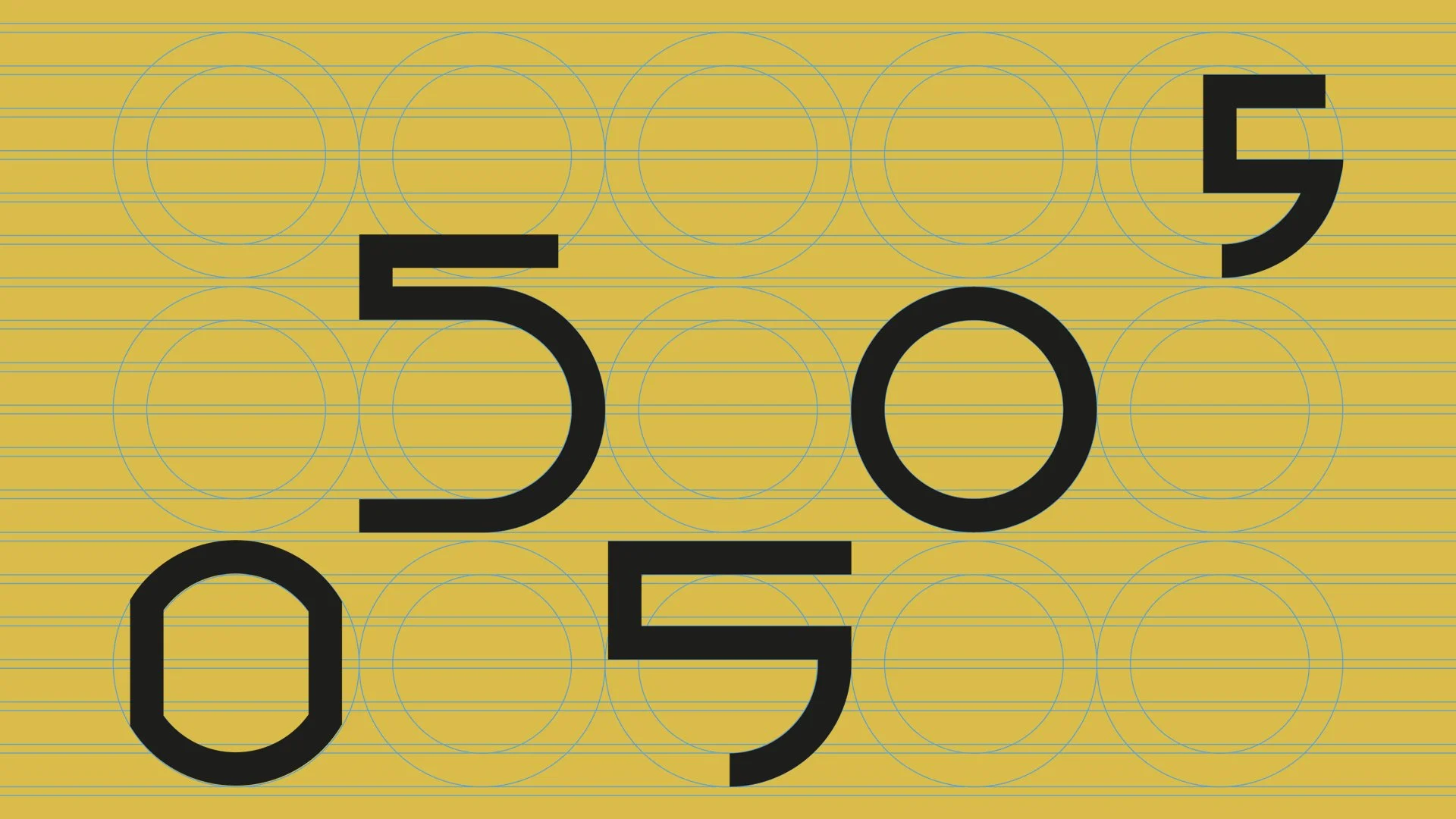

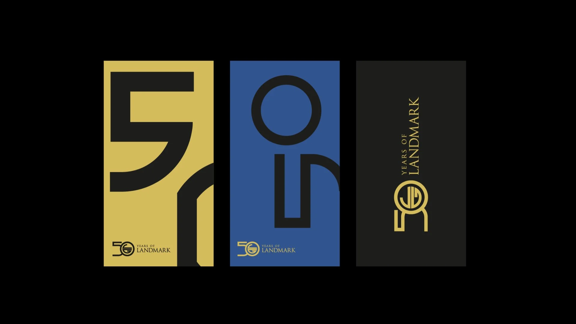

Multiple interpretations of “50,” varied in form but unified by a single structure.